Do they no longer teach people about type kerning?
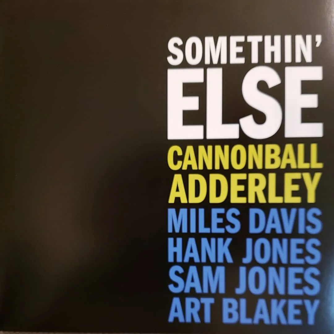
Front cover, iconic, from Blue Note in the 50s. Rear cover, done 2012 for a reissue.
What’s up with the E and T bumping into each other? Feels like someone has to go out of their way


Do they no longer teach people about type kerning?
Front cover, iconic, from Blue Note in the 50s. Rear cover, done 2012 for a reissue.
What’s up with the E and T bumping into each other? Feels like someone has to go out of their way
This site is part of the ⁂ open social web, a network of interconnected social platforms (like Mastodon, Pixelfed, Friendica, and others). Unlike centralized social media, your account lives on a platform of your choice, and you can interact with people across different platforms.
By entering your profile, we can send you to your account where you can complete this action.